CLIENT
AYKIN Accounting.
SERVICES
Strategy + Identity design + Brand guidelines
CHALLENGE
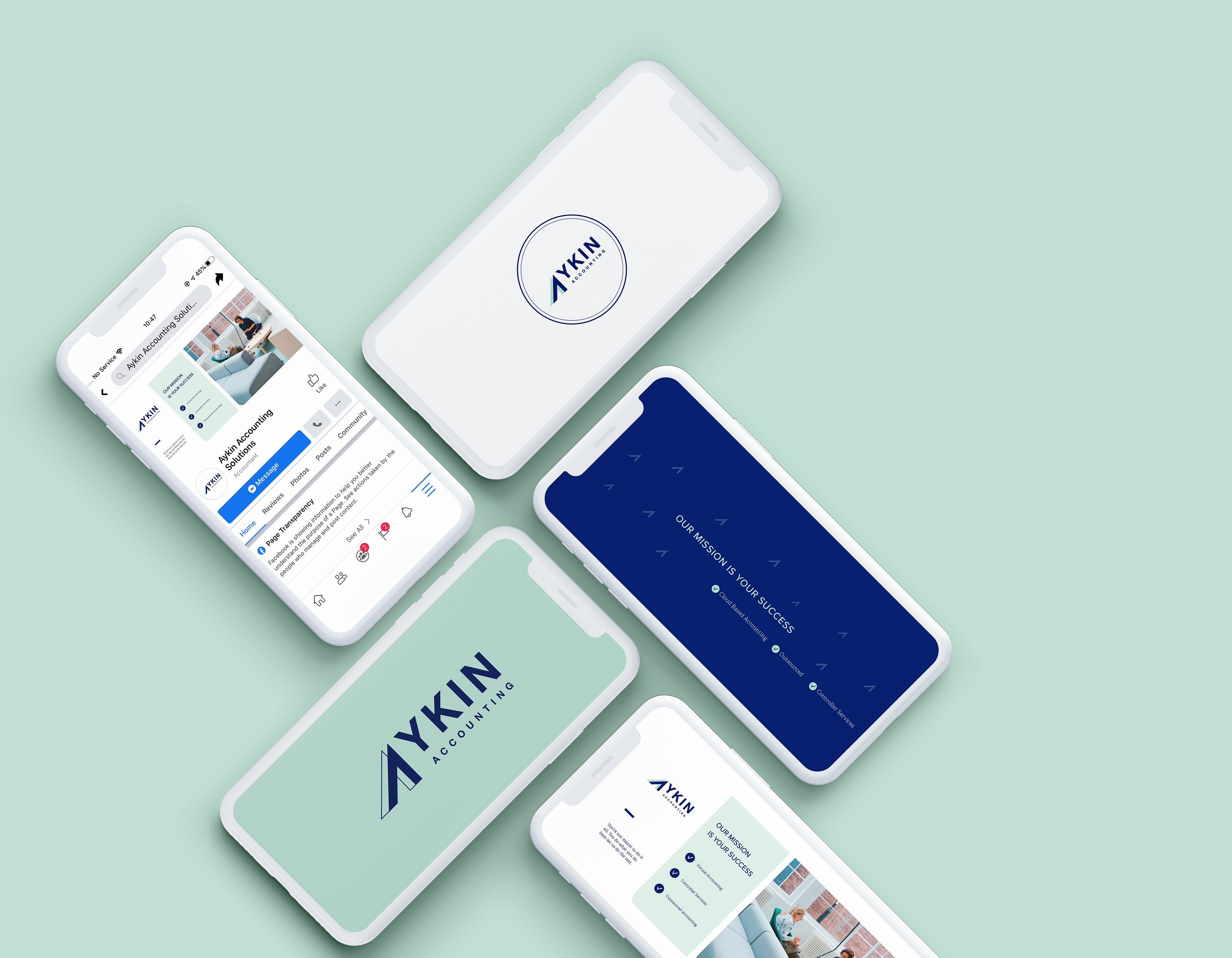
Aykin Accounting needed a seasoned expert to help them strategize their brand launch and establish design guidelines and logos. They needed to be seen as a modern, reliable, and savvy financial expert to businesses in the fast-paced hospitality industries such as hotels, vacation rentals, and restaurants.
OUTCOME
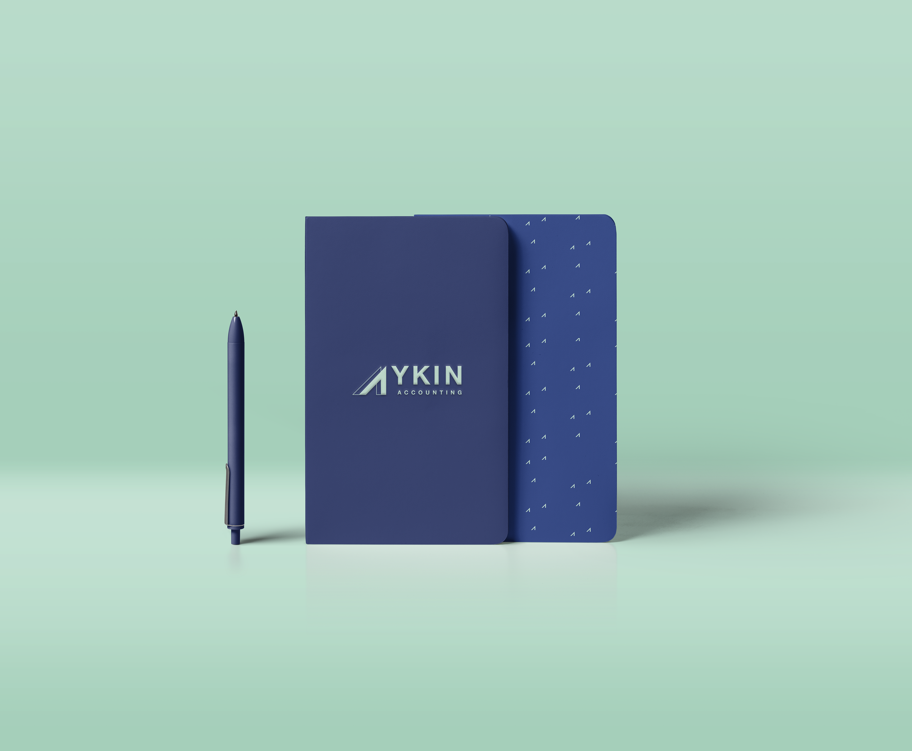
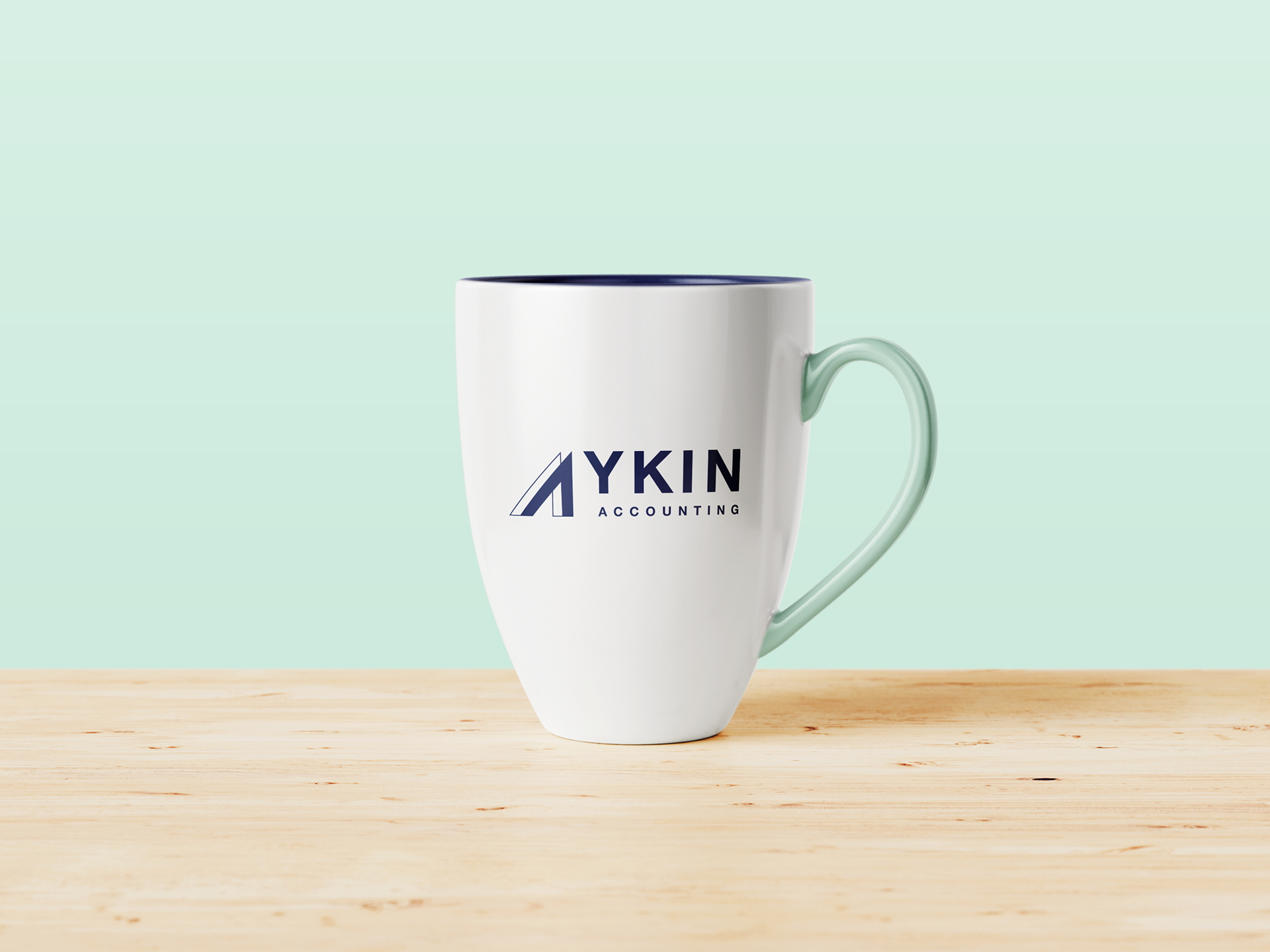
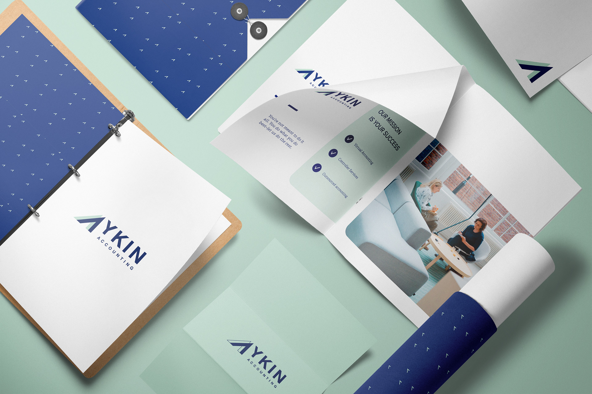
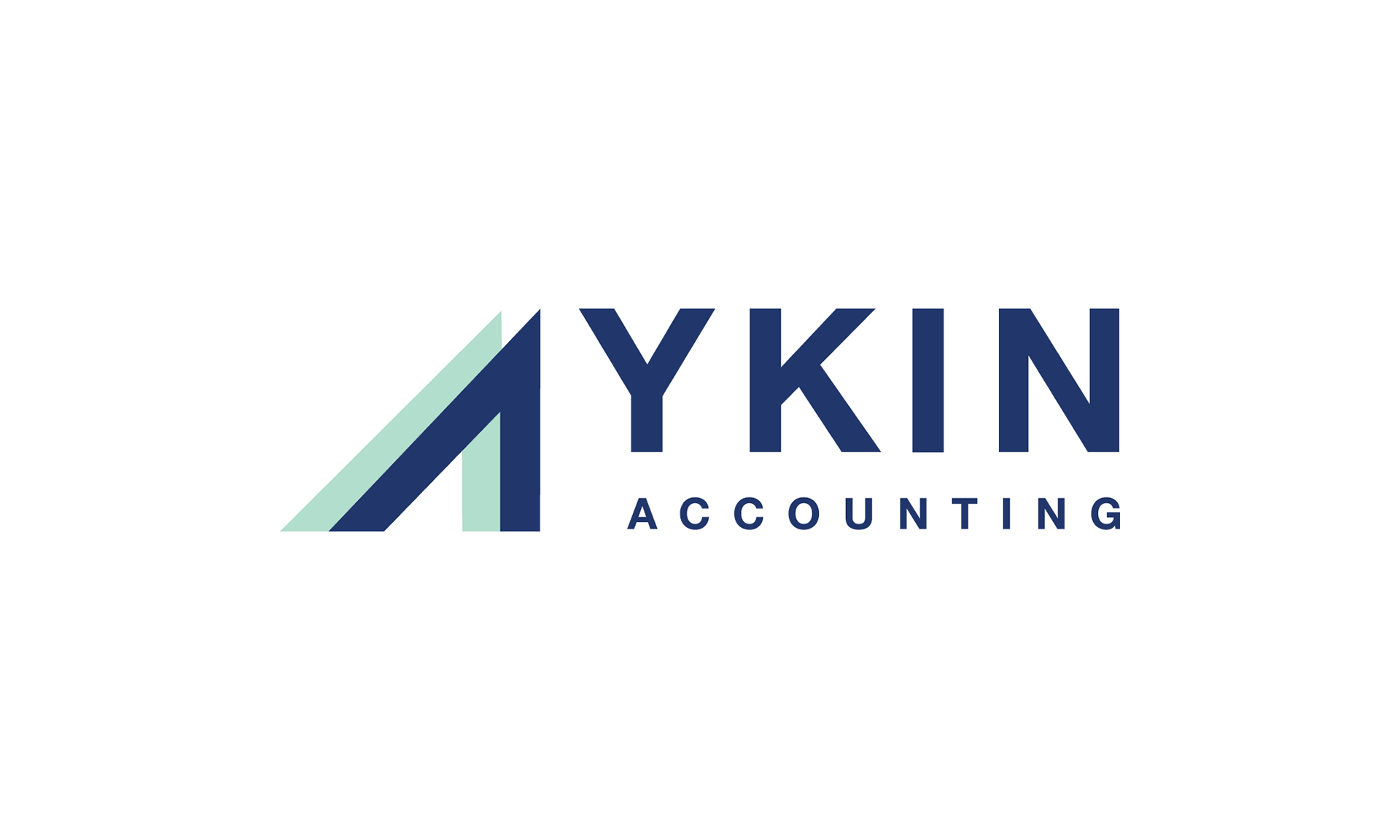
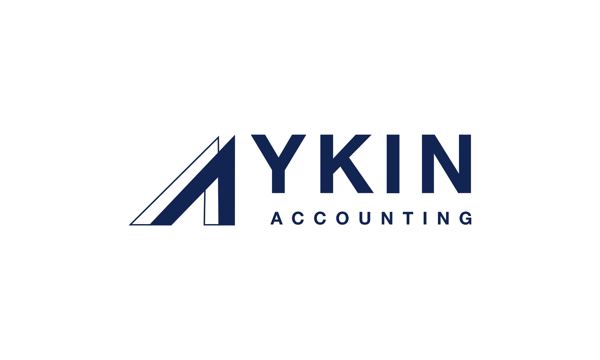
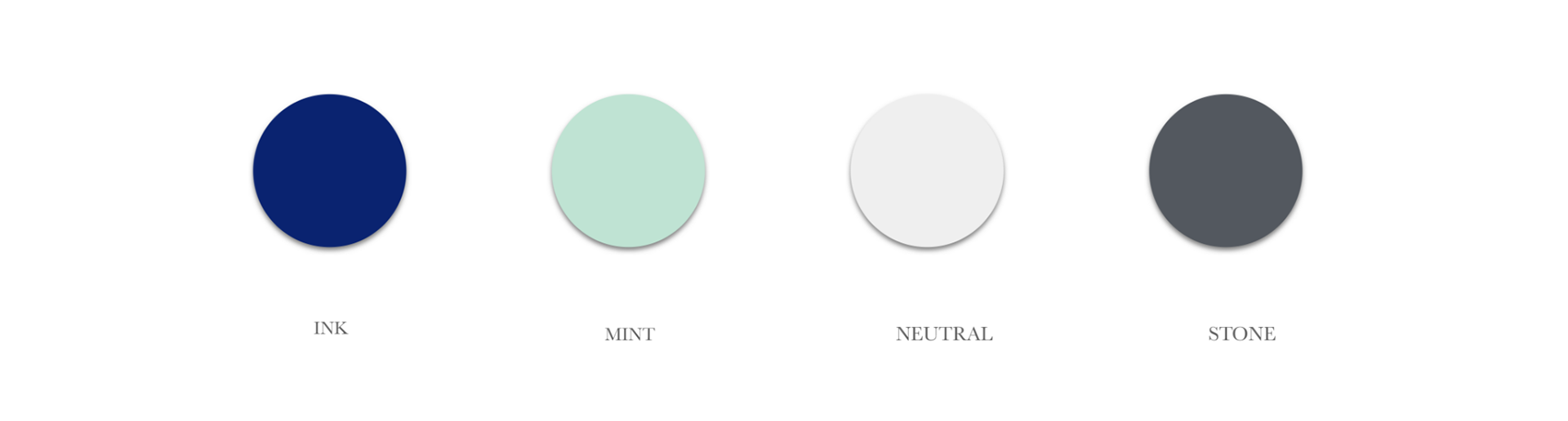
Our strategy session helped to nail down Aykin’s target audience, goals, and brand positioning. We created a memorable, trustworthy and timeless identity to facilitate brand loyalty and to remain top-of-mind when the consumer is considering whether to purchase services. The visual direction of the logo plays off the duality of fresh and modern with that of the reliable, committed ethic of the company. Bright, fresh colors and abstract shapes create a vibrant feel that represents diversity and liveliness. The primary logo features bold san serif font and two A’s crafted into an upward arrow to represent growth. Precise, sharp edges allude to the accuracy and reliability of the brand. The result is a logo that feels clean, sincere, trustworthy and reliable.
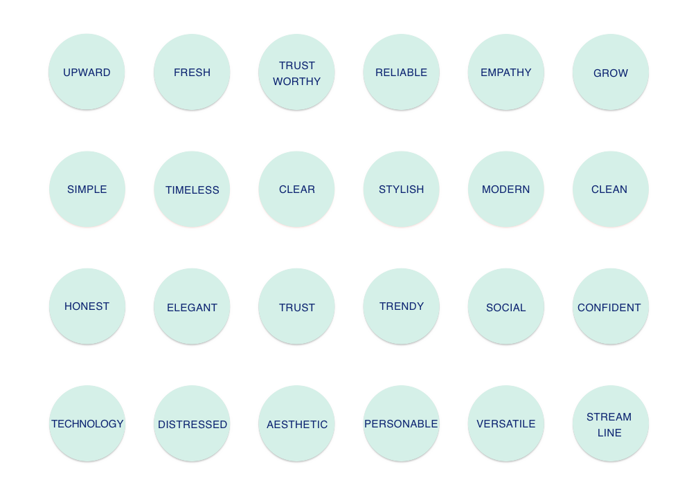
BRAND ATTRIBUTES
MOODBOARD

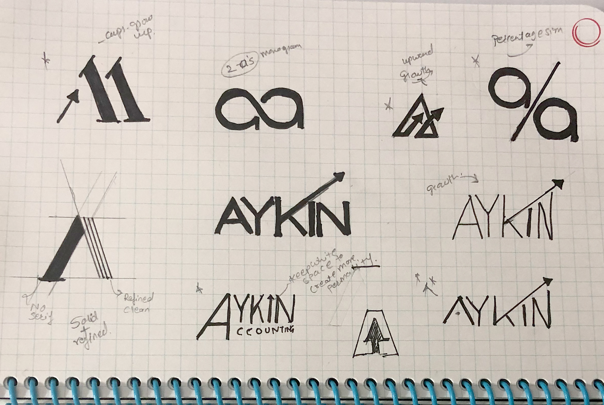
SKETCHES

PRIMARY LOGO
SECONDARY LOGO
SUBMARK

PRIMARY COLOR PALETTE
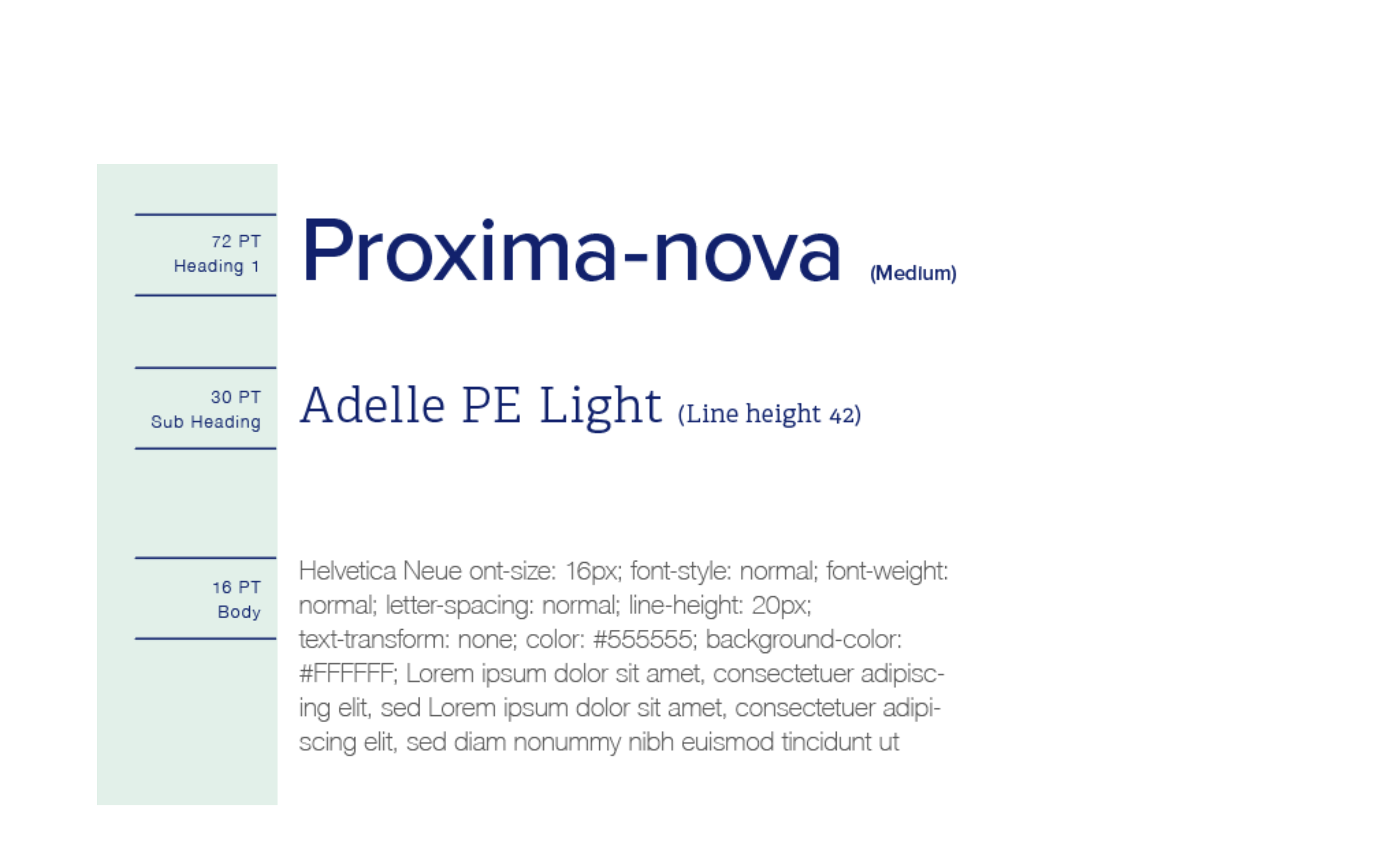
TYPOGRAPHY